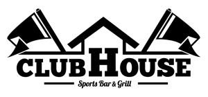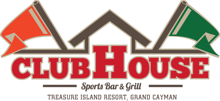
Identity for sports bar / restaurant in Grand Cayman. 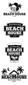
The project’s original name was to be “Beach House” – which is were we started developing concepts. Late in the process the restaurant changed direction (and name) leaving us in a bit of a pickle. We didn’t want to blow the budget by returning completely to the drawing board so we had to “massage” one of the existing concepts into something that would work with the new name and concept “Clubhouse”.
The fun challenge on this one involved the international audience present on-island. The American “standard three” sports (baseball, football and basketball) would have been an insensitive go-to for imagery… Likewise looking to the European standard of Soccer would be missing half the audience too.
We eventually settled on flag / pennants for symbology.
ALTERNATIVE
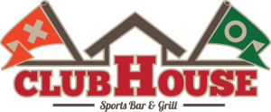
This was one of the final revs of the logo during development… I wanted the concept of the two flags being of opposing sides to carry through to black and white. But how do you do that and remain as “global” as possible… Best solution we came up with was “X” and “O” or.. more appropriately referencing it’s origin: Â Noughts and Crosses.
The client shot this down at the last minute before locking the logo down. I probably should have fought harder to keep it in the final – but you know… gotta pick your battles.
